Components
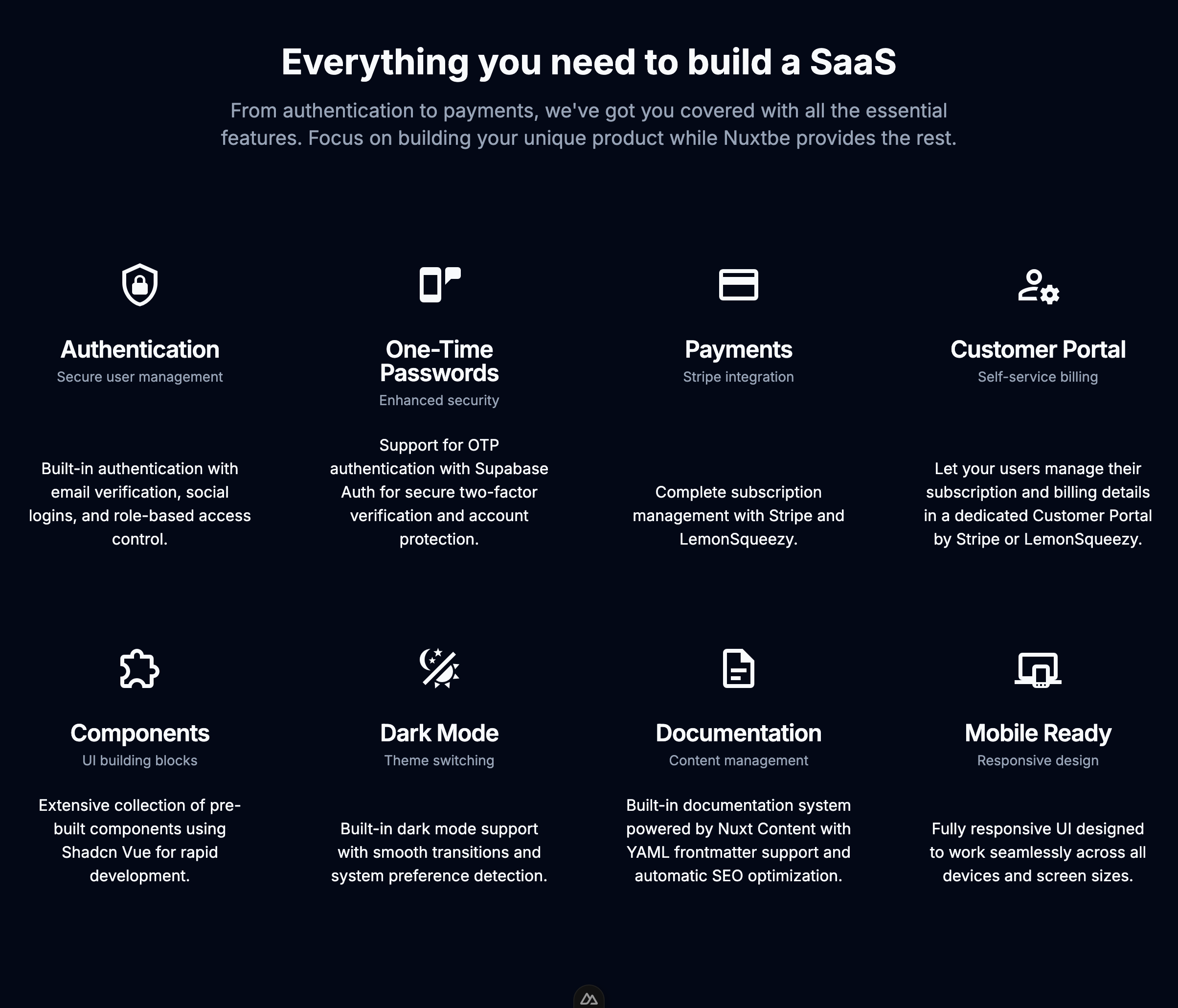
The Nuxtbe library provides a comprehensive set of pre-built components designed specifically for landing pages. These components can be found in the app/components/landing directory.
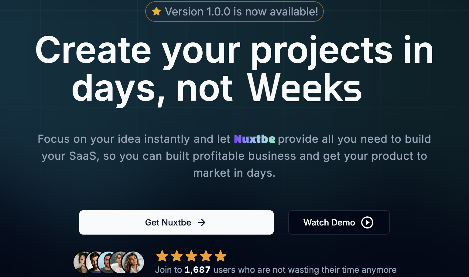
Hero Card
A primary landing section component that renders a headline, description, and call-to-action buttons. Implements a visually prominent design to maximize visitor engagement and effectively communicate the core value proposition.
Best Practices:
- Place this component at the top of your landing page
- Keep the headline clear and concise (4-8 words)
- Use action-oriented CTA buttons
- Test different variations of copy and button text
Hero With Icons
An enhanced hero section component that integrates icon elements to provide visual representation of features or benefits. Implements a balanced layout that combines text content with iconography for improved visual hierarchy.
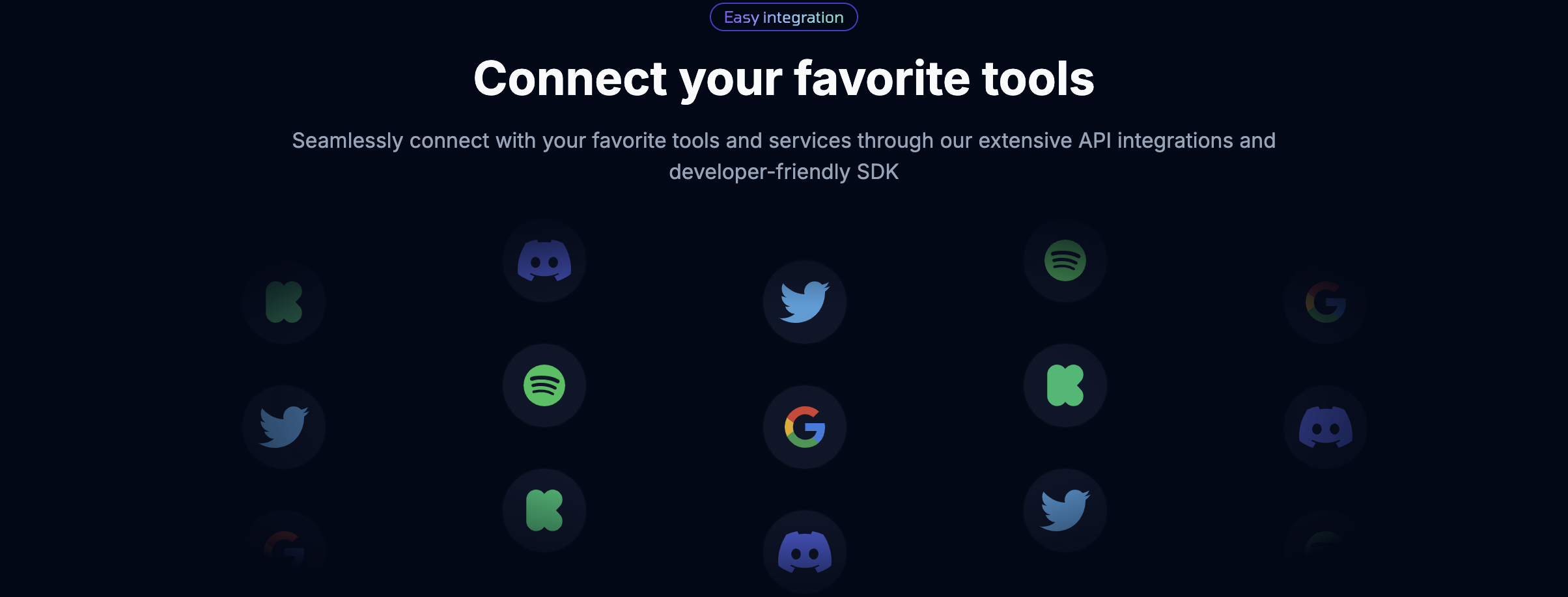
Apps Card
A grid-based display component for showcasing platform integrations and compatibility. Implements a structured layout ideal for presenting technology stacks, third-party integrations, or supported platforms.
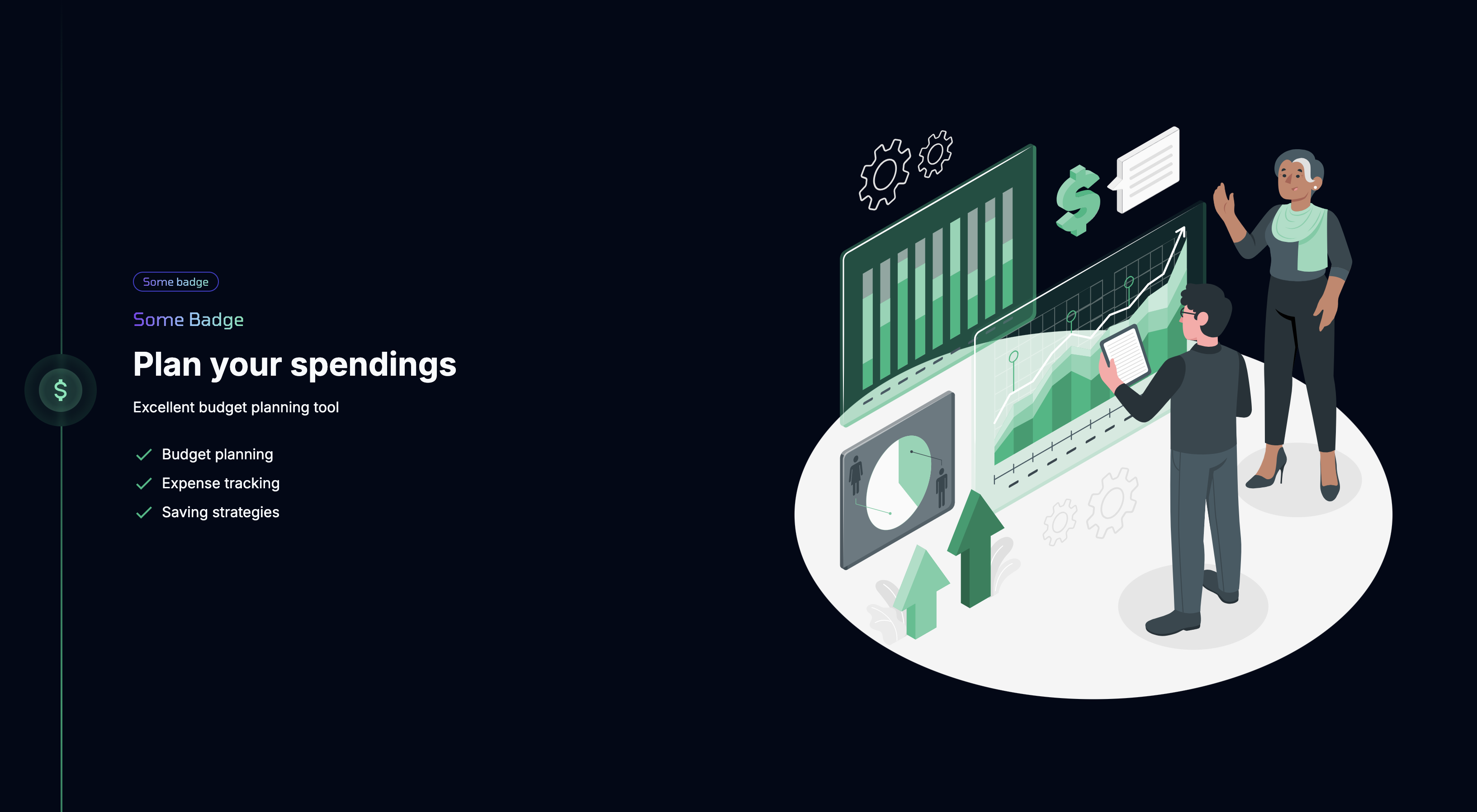
Hero List
A hybrid component that combines visual elements with structured feature lists. Implements a layout optimized for detailed product explanations supported by relevant visuals.
Best Practices:
- Alternate between left and right aligned content for visual interest
- Use high-quality images or videos
- Keep feature descriptions concise
- Highlight technical capabilities with relevant icons
Card List
A container component that renders multiple cards in an organized grid layout. Implements consistent spacing and styling for presenting feature sets or service offerings.
User Rating
A social proof component that displays user feedback with visual rating indicators. Implements a standardized format for presenting customer reviews and ratings.

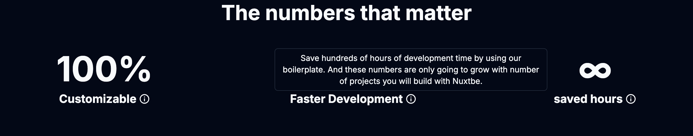
Advantages Numbers
A metrics display component that renders key statistics and achievements. Implements large numerical displays with supporting descriptive text to highlight important data points.
Marquee
An animated content component that implements continuous horizontal scrolling. Provides smooth animation for displaying customer logos, testimonials, or feature highlights in a dynamic format.
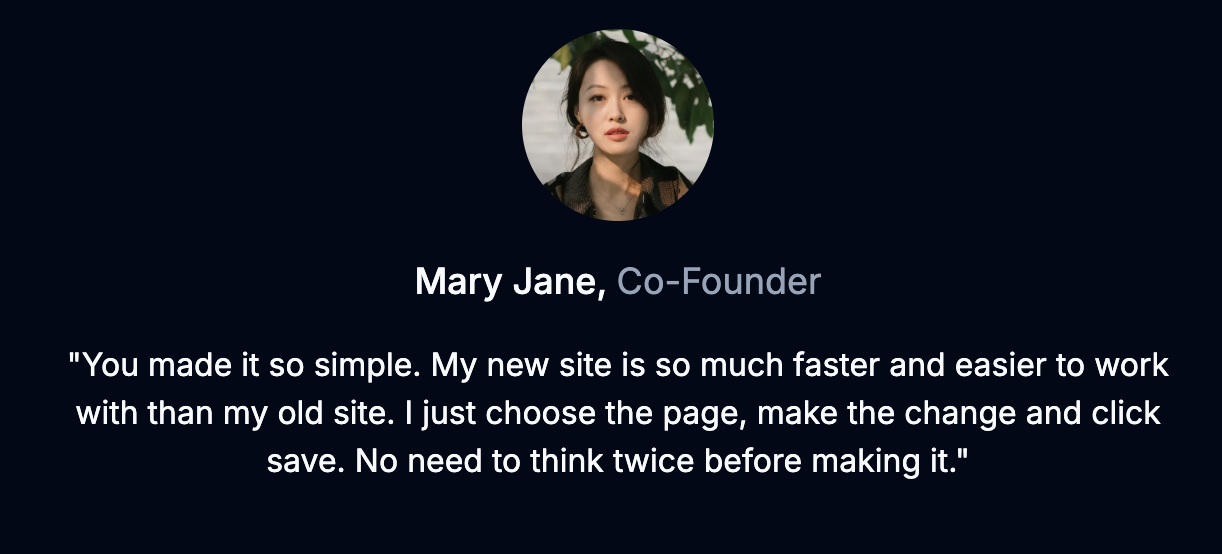
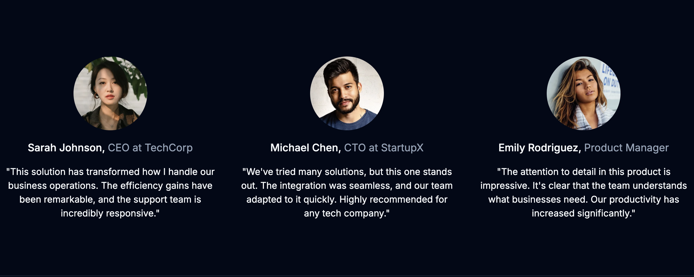
Testimonial
A customer feedback component that renders individual testimonials. Implements a structured layout for displaying profile images, names, roles, and quoted content.
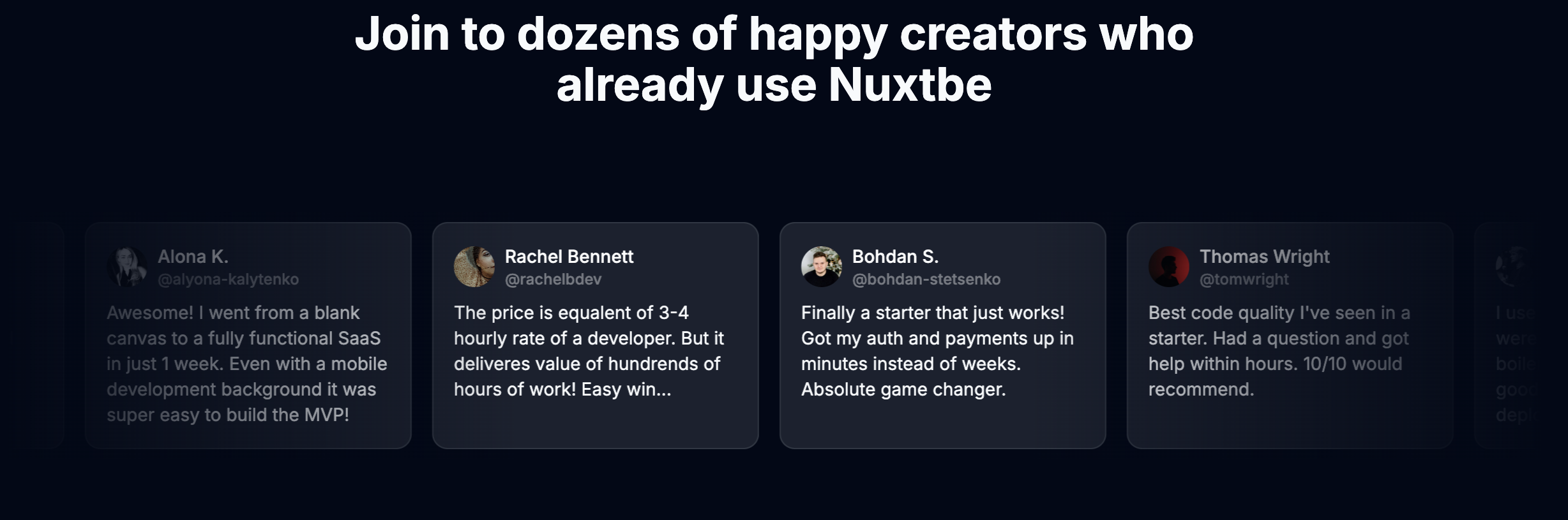
Testimonials List
A collection component that renders multiple testimonials. Implements either a grid or carousel layout to display multiple customer testimonials with consistent styling.
Storyline
A component that implements a storytelling narrative. Renders a series of images or videos with accompanying text to create a compelling story. Can be used to showcase the journey of a product or service. Or may be use in changelog.
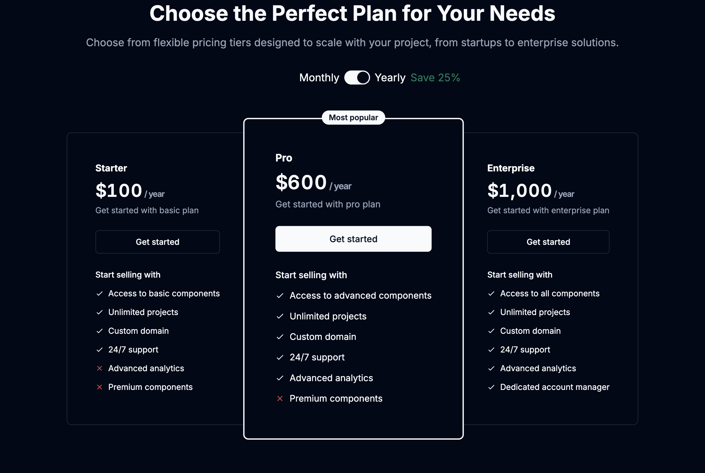
Pricing Cards
A pricing display component that implements a clear comparison of service tiers. Renders pricing information, feature lists, and subscription options in a structured table format.
Who am I
A biography component that implements a personal introduction section. Renders profile imagery, biographical content, and social media integration with consistent styling.

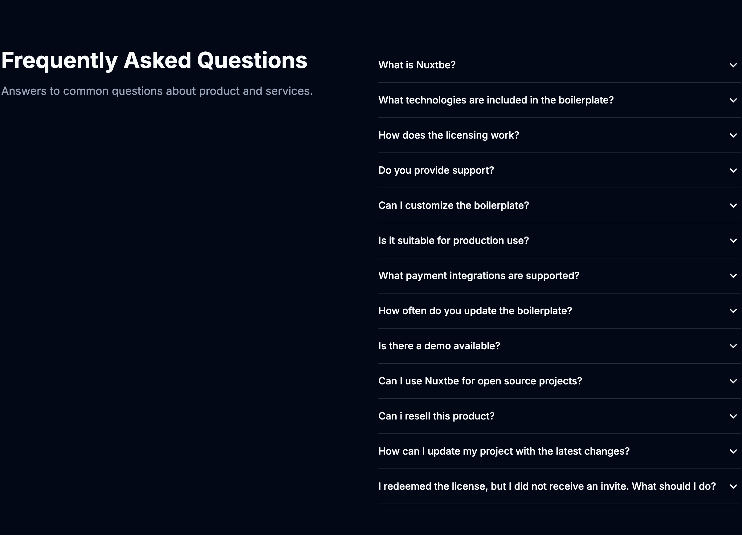
FAQ
An expandable content component that implements an accordion interface. Renders frequently asked questions and answers in a collapsible format for improved content organization. Configured with app.config.ts.