To configure different parts of Nuxtbe, you can use the nuxt.config.ts and app.config.ts files.
The nuxt.config.ts file is the main configuration file for your Nuxt application. Here's a detailed breakdown of each configuration option:
$development: {
  routeRules: {
    '/': { prerender: false, isr: false },
    '/docs': { prerender: false, isr: false },
  },
}
Development-specific settings that disable prerendering and ISR (Incremental Static Regeneration) for development environment.
$production: {
  icon: {
    clientBundle: {
      scan: true,
      sizeLimitKb: 512,
    },
  },
}
Production-specific settings for icon handling, including automatic icon scanning and size limits.
devtools: { enabled: true }
Enables Nuxt DevTools for enhanced development experience.
future: {
  compatibilityVersion: 4
}
Sets the compatibility version for future Nuxt releases.
site: {
  url: process.env.BASE_URL || 'http://localhost:3000',
  name: 'Nuxtbe - Nuxt SaaS Starter Kit',
  description: '...',
  defaultLocale: 'en'
}
Defines core site metadata for Nuxt SEO including URL, name, description, and default locale.
ogImage: { enabled: false }
robots: {
  enabled: true,
  disallow: ['/secret', '/admin', '/dashboard']
}
Configures Open Graph images and robots.txt settings for SEO optimization. Dynamic Open Graph images are disabled by default because it can significantly increase build times and bundle size.
runtimeConfig: {
  resendApiKey: process.env.RESEND_API_KEY || '',
  // ... other API keys and secrets
  public: {
    baseURL: process.env.BASE_URL || 'http://localhost:3000'
  }
}
Manages runtime environment variables, including API keys and public configurations.
routeRules: {
  '/': { prerender: true, isr: true },
  '/docs': { prerender: true, isr: true },
  '/dashboard/settings': { redirect: '/dashboard/settings/general' },
  '/dashboard': { redirect: '/dashboard/cards' }
}
Defines routing rules including prerendering, ISR, and redirects.
Read more at Learn more about prerendering
router: {
  options: {
    scrollBehaviorType: 'smooth'
  }
}
Configures router behavior like smooth scrolling.
experimental: {
  viewTransition: true,
  typedPages: true
}
Enables experimental features like view transitions and typed pages.
Read more at Learn more about experimental features
imports: {
  dirs: ['types/**/*.ts', 'types/*.ts']
}
Configures auto-imports for TypeScript types.
modules: [
  '@nuxtjs/tailwindcss',
  '@vueuse/nuxt',
  // ... other modules
]
Lists all Nuxt modules used in the project, including UI, utilities, and functionality extensions.
build: {
  transpile: ['@vueuse/motion']
}
Specifies build-time transpilation settings.
components: [
  {
    path: '~/components',
    pathPrefix: false
  }
]
Configures auto-import settings for Vue components.
colorMode: {
  classSuffix: '',
  preference: 'dark',
  fallback: 'dark'
}

shadcn: {
  prefix: '',
  componentDir: './app/components/ui'
}
Configures color mode preferences and Shadcn UI component settings.
stripe: {
  server: {
    key: process.env.STRIPE_SERVER_SECRET_KEY
  }
}

supabase: {
  redirectOptions: {
    login: '/sign-in',
    callback: '/api/auth/callback',
    exclude: ['/'], // ... other excluded paths
    cookieRedirect: true
  }
}
Configures integration with Stripe payment processing and Supabase backend services.
eslint: {
  config: {
    stylistic: {
      indent: 2,
      quotes: 'single',
      semi: true
    }
  }
}
Defines code styling rules through ESLint configuration.
The app.config.ts file contains runtime configuration for your application. Here's a detailed breakdown of each section:
General settings are used to configure the application name and contact email. These values are used throughout the app, therefore it's a simpliest way to change you brand name and contact email across the app.
general: {
  contactEmail: string    // Primary contact email used for system notifications
  name: string           // Application name used throughout the app
}
Billing configuration is used to configure the billing provider, allow unauthenticated access to the pricing page, and configure the customer portal URL. More information about billing configuration can be found in the Billing Configuration section.
billing: {
  billingProvider: 'lemonsqueezy' | 'stripe'  // Payment provider selection
  allowUnauthenticated: boolean               // Allow access to pricing page without auth
  customerPortalUrl: string                   // URL to customer billing portal
  isSubscription: boolean                     // Whether to use subscription or one-time payments
  featuredBadgeText: string                   // Text shown on featured plan badge
  yearSavings: number                         // Percentage savings for yearly plans
  plans: {
    productId: string                         // Provider-specific product ID
    paymentLink: {
      monthly: string                         // Monthly subscription checkout URL
      yearly: string                          // Yearly subscription checkout URL
      oneTime: string                         // One-time payment checkout URL
    }
    name: string                              // Plan name
    priceMonth: number                        // Monthly price
    priceYear: number                         // Yearly price
    description: string                       // Plan description
    features: string[]                        // List of included features
    notAvailableFeatures: string[]           // List of excluded features
    buttonText: string                        // CTA button text
    buttonVariant: 'outline' | 'default'      // Button style
    isFeatured: boolean                       // Whether this is the featured plan
  }[]
}
Main navigation is used to configure the main navigation links. It's used in the MobileNav component to show the navigation links on mobile devices.
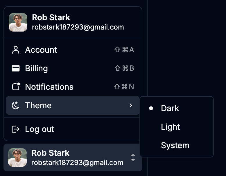
navigation: {
  enableColorSwitch: boolean     // Enable theme switcher
  links: {
    title: string               // Section title
    links?: {                   // Optional nested links
      title: string            // Link title
      description: string      // Link description
      to: string              // Route path
    }[]
    to?: string               // Direct route path if no nested links
  }[]
}
navigation.userMenu: {
  enableIcons: boolean          // Show icons in menu items
  links: {
    title: string              // Menu item title
    to: string                 // Route path
    icon: string              // Icon name from iconify
    shortcut: string          // Keyboard shortcut hint
  }[]
}
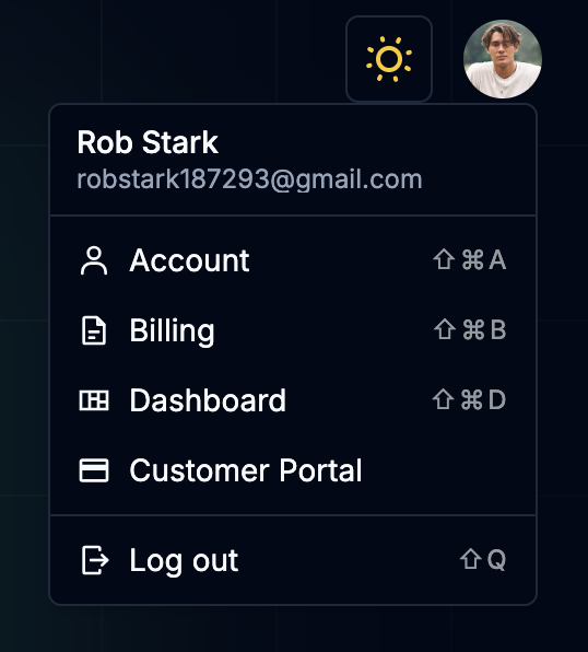
Dashboard user menu is used to configure the user menu links in the dashboard. It's a separate list because it's possible that you may want to have different links in the dashboard user menu than in the main user menu.
dashboardUserMenu: {
  enableIcons: boolean         // Show icons in menu items
  links: {
    title: string             // Menu item title
    to: string                // Route path
    icon: string             // Icon name from iconify
    shortcut: string         // Keyboard shortcut hint
  }[]
}
The FAQ section allows you to configure frequently asked questions that appear on your site. This is commonly used on landing pages or help sections to provide quick answers to common user questions.
The FAQ configuration also includes a section title and description that appear above the questions to provide context.
faq: {
  title: string               // FAQ section title
  description: string         // FAQ section description
  items: {
    value: string            // Unique identifier
    title: string           // Question
    content: string         // Answer
  }[]
}
Social links configuration allows you to display social media profiles across your site. Each social link requires a platform name, URL, and an icon from the Iconify library.
The social links are commonly used in footers, about pages, or contact sections to provide easy access to your social media presence.
socialLinks: {
  platform: string           // Social platform name
  url: string               // Profile URL
  icon: string              // Icon name from iconify
}[]
Here's how to modify the configuration:
export default defineAppConfig({
  general: {
    contactEmail: '[email protected]',
    name: 'My SaaS',
  },
  billing: {
    billingProvider: 'stripe',
    plans: [
      {
        productId: 'prod_xyz',
        name: 'Basic',
        priceMonth: 9,
        // ... other plan details
      },
      // ... other plans
    ],
  },
  // ... other configurations
});